MWC 2012: Preview of HTC Sense 4
Even though HTC One X was presented just a few days ago the prerelease firmware has already leaked into the web. Wizards from
xda-developers and
4pda.ru
used this opportunity and ported the new firmware to HTC Sensation and
HTC Evo 3D which I have used for this review of Sense 4.0. I want to
personally thank
@mdeejay_ru for the the port.
Desktops
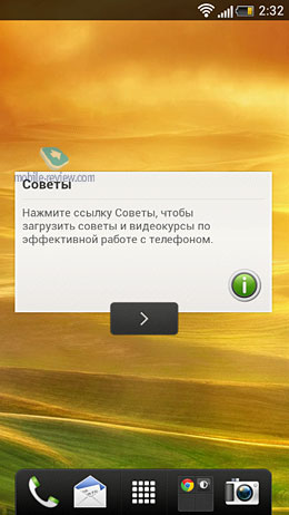
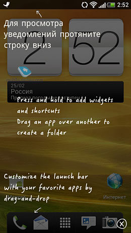
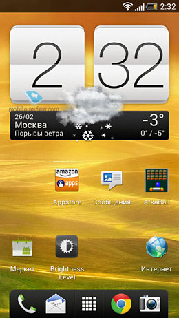
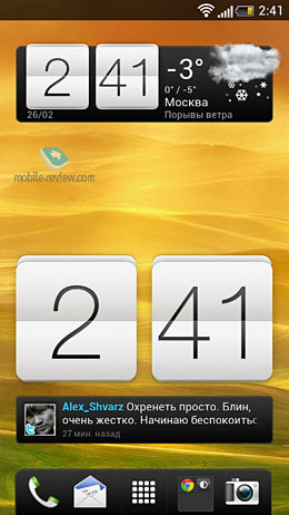
The first thing you notice is the new bottom bar. Finally, HTC
made it customizable and you can now put any icons you want there: app,
quick contact action (view, call or text), a media playlist, a browser
tab or a folder. The big Phone icon is gone and on the one hand it is
right but then on the other many people really liked it. It would be
better if users had a choice of the bar appearance.
Creating folders on desktops has become easier – all you need to
do is to drag and drop an icon onto another one. If only one icon
remains in a folder then the folder disappears. The new Sense has a
limit of 12 icons per folder for reasons unknown and it is a downer.
Swiping between desktops looks very much the same as in the
previous Sense versions and it is accompanied with very nice 3D
animation. However, circular swiping is not available in this version.
Apps
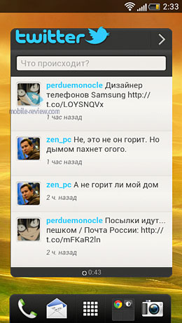
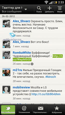
The preinstalled Twitter client Peep has become a part of the
Friends Stream app but it still has a slightly different full screen
widget.
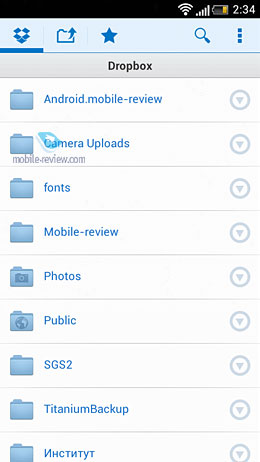
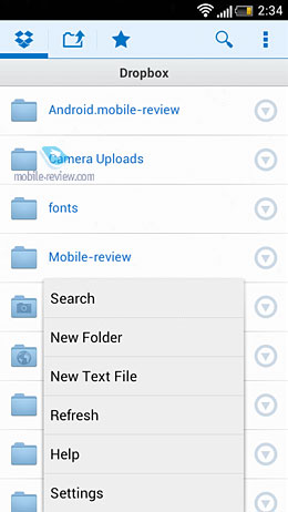
The Dropbox app has been added and rumors say that owners of the
new HTC devices will receive extra storage space in this service but
this information has not been verified. You can find a detailed review
of Dropbox
here.
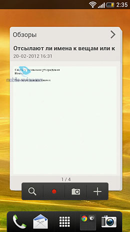
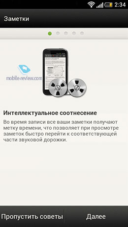
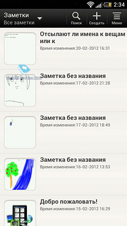
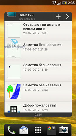
Another new app is Notes and it is not merely a notepad for short
memos but a specially adapted version of Evernote for HTC Sense. It
appeared first on HTC Flyer and HTC Sensation XL.
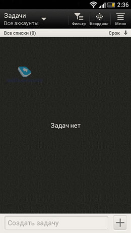
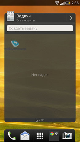
Tasks is a simple app for to do lists. It can sync with your
Google account but, unfortunately, older tasks will not be available.
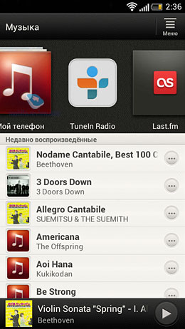
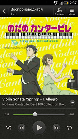
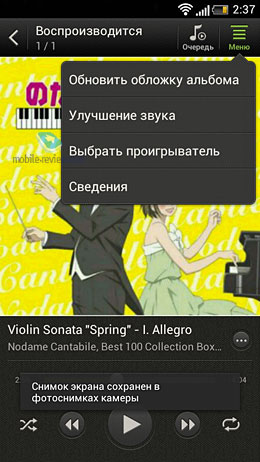
The Music app has got new looks and is now integrated into the
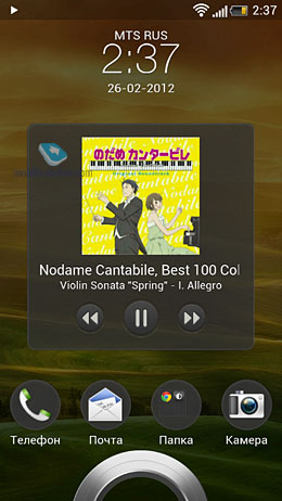
TuneIn Radio and Last.fm services. The lock screen displays the album
cover and playback controls. By the way, the Sense 3.0 bug with flipping
album covers has been fixed. The Beats Audio enhancer is still there.
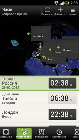
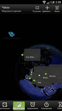
The World Time tab in the Clock app now displays the world map with selected cities.
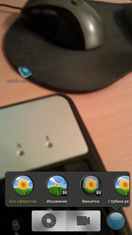
The Camera app now features a blue button that applies the selected effect to the picture e.g. black and white.
Widgets and Customizing
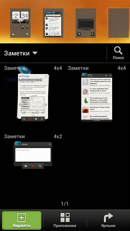
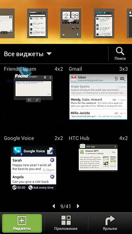
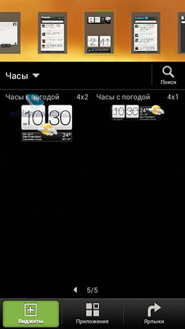
The widget menu now looks differently. Formerly it was a simple
list – now it is a thumbnail matrix. The matrix works fine with the
preinstalled widgets but only displays the size and icons of third party
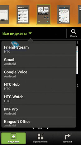
widgets. Anyway, you can select a widget from the list by tapping the
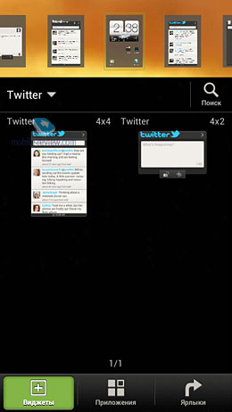
All Widgets button. Similar widgets are grouped that is Twitter widgets
of different size are displayed together. Once again, this grouping does
not work for third party widgets. Google widgets are resizable while
HTC Sense ones are not.
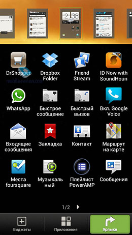
At the bottom there are now three tabs: Widget, App and Shortcut
for quick selection of the item you want to add to a desktop. Adding
elements has also become easier – you only need to tap once on an
element in the respective tab to add it onto the selected desktop.
I said that the first thing you notice is the bottom bar but on a
second though I think it is the new clock and weather widget which I
find hideous. 'Clock and Weather' is a landmark of HTC immediately
recognized and copied by many other manufacturers and it was a really
bad idea to change it. However, it is a matter of taste and you may like
it. This widget is available in three modes: 4x2, 4x1 'Clock and
Weather and 4x2 'Clock and Friendstream'. The smaller size seems more
appropriate as it is as informative as the bigger ones and saves a lot
of space on the desktop.
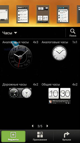
The Contacts widget is no longer available in the 4x3 size – another downer for me as I favored this size.
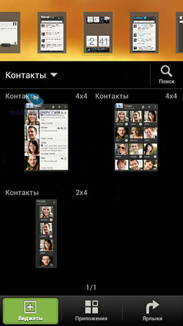
Swiping now works for third party widgets that support this feature (e.g. Plume).
Lock Screen
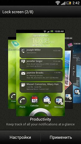
Any icons placed on the bottom bar are duplicated on the lock
screen. I don't like this feature and I would much rather prefer to use
different shortcuts on the lock screen.
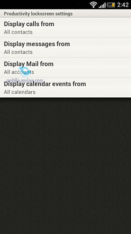
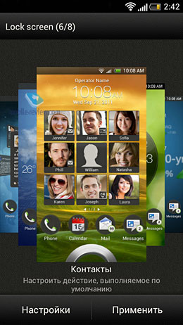
There are now two new lock screens: 'Contacts' and 'Important'.
The Contacts lock screen displays a matrix of selected contacts. You can
call a contact by dragging his icon into the circle. Unfortunately, I
couldn't get the Important lock screen to work but I know it displays
calendar events, tasks, new mail, missed calls and SMS. Also, the system
tray is now accessible from the lock screen.
Phone, Contacts and Messages
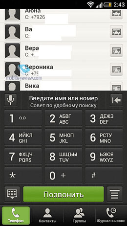
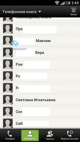
These three apps are now all gray. The phone app now has four
tabs: phone, Contacts, Groups and Missed Calls. You can remove or
rearrange the tabs. The transition between the tabs is accompanied by a
very nice animation. I would also like to see a gesture control feature
to switch between tabs.
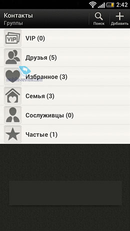
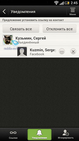
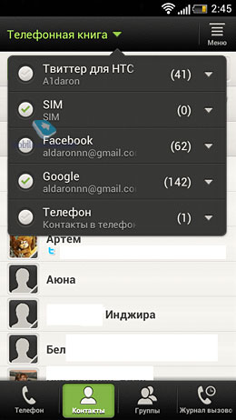
The Contacts tab now features the Notification bar that displays
prompts on contacts arrangement, here you can also add all your phone
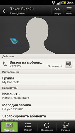
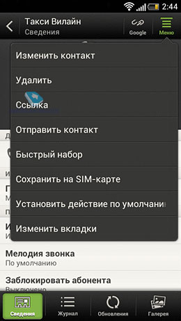
book contacts to friends. Also, now when you view a contact first his
big picture is displayed.
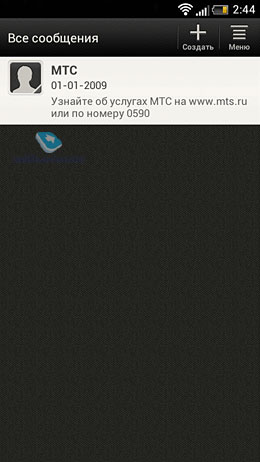
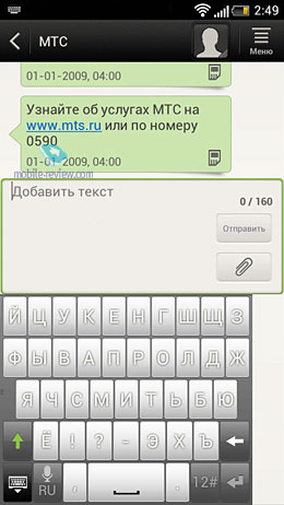
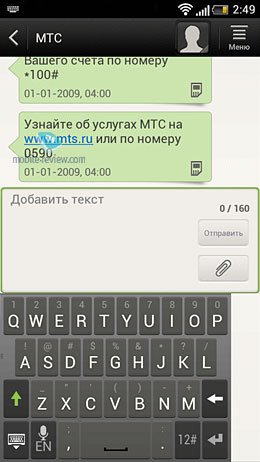
The Messages app looks very much the same but see for yourself:
Settings
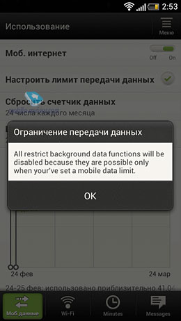
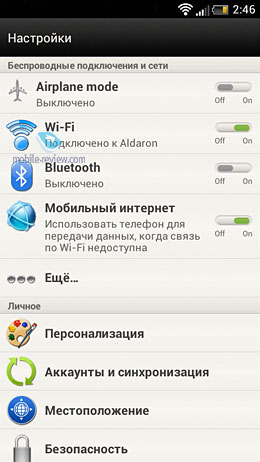
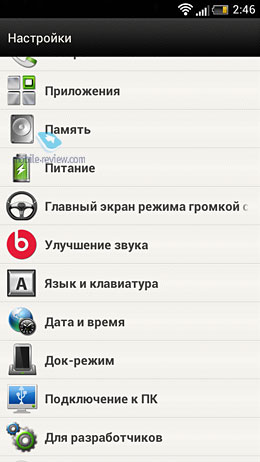
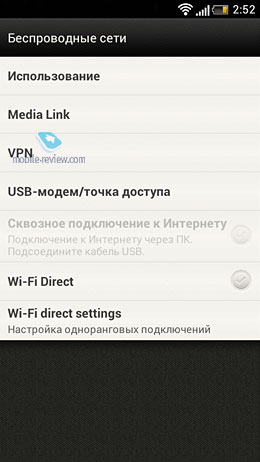
The Wireless Networks menu is now a lot more detailed and you can
turn on/off any wireless interface or browse its settings. There is now a
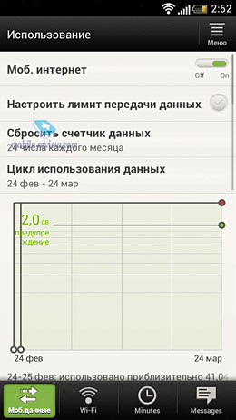
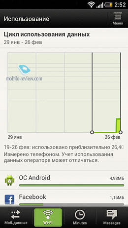
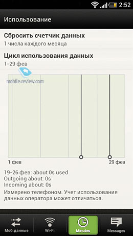
separate menu of settings for developers. Also, there is a new traffic
monitor app that can tell you how much traffic goes through your phone
and display statistics for every app.
Miscellaneous
By default this overlay uses the Roboto font and you cannot change
it using standard means. Also, all Google apps have got new sleeker
looks.
The Enable/Disable feature for wireless interfaces is gone from
the system tray, instead there is a small Settings button that opens the
wireless settings menu.
The key pad is now gray for English and white for a second language.
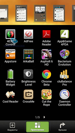
The App menu is now a number of screens you swipe between horizontally.
Bottom Line
First of all, I want to remind the readers that this review is
based on a ported firmware from HTC One X (previously Endeavour) to HTC
Sensation so it is not completely out of question that some menus and
settings are going to be partly or completely changed. However, I think
we can get an idea of what Sense 4.0 is about.
Briefly on ups and downs of Sense 4.0:
Ups:
- the bottom icon bar
- tabs in menus
- swipe enabled third party widgets
- resizable Google widgets
- quick effect button in the camera app
- new lock screen features
- accessibility of the system tray from the lock screen
- adding widgets and apps to desktops has got easier
- size for the Clock and Weather widget
- Evernote integration
- Dropbox integration
- Last.fm and TuneIn Radio integration
Downs:
- some icons cannot be added to the bottom bar or the lock screen
- arbitrarily ugly clock widget
- no wireless interface controls in the system tray
- no modes for the bottom bar (cannot put the big phone button back)
- no file manager
- cannot change the desktop or the app menu matrix size
- no circular swiping between desktops
HTC have been steadily improving the Sense UI but they seem to be
taking their time and while Apple can afford adding just a handful new
features every year Android manufacturers should be a lot quicker. If an
Android user does not like the launcher he will find another one, if
the standard widgets are ugly he will download new ones. And in a while
he will ask himself question: Why am I paying more for the UI if I end
up not using it?
As usual, the Sense UI has great widgets, lock screens and the
phone apps. However, the desktops remain a downer – they have less
settings than Go Launcher Ex. And even the phone app could use some
smart ideas from rivals.
I liked most of the new features in Sense 4.0 but I would like to
see the desktops get smarter and on a par with rivaling solutions.









No comments:
Post a Comment